MTA Subway Map Redesign Sparks New Yorker Reactions
03.04.2025
New Yorkers Respond to MTA’s Revamped Subway Map. This is reported by the railway transport news portal Railway Supply.

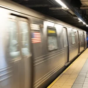
Photo by Marc A. Hermann/MTA
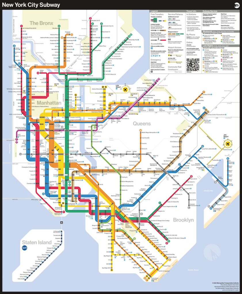
The MTA subway map redesign debuted on Wednesday, igniting diverse opinions among New Yorkers. Bright colors and clearer labels mark this bold update.
Don’t miss…Automated Metro Train by CAF Unveiled in Madrid
This iconic map, a celebrated symbol of New York City, helps millions navigate its vast underground transit network daily. Now, the fresh version stirs both excitement and skepticism from locals and tourists alike.
Jeff, a frequent 7 train rider, relies heavily on the map for his daily commute and new routes. He notes the new design closely mirrors its predecessor, crediting the MTA’s thoughtful nod to tradition.
Drawing from past maps, the creative team preserved the MTA’s signature colors and style for this update. They crafted a digital version now gracing subway cars, stations, and printed guides across the city.
Jenny, a Midwest visitor, finds the map’s color-coding helpful yet overwhelming due to the system’s sheer size. She believes it simplifies navigation for regular riders, despite its daunting first impression.
MTA officials collaborated with accessibility groups to enhance the map’s inclusivity and highlight ADA-compliant stations. Designers prioritized legible text, efficient spacing, and high-contrast symbols to improve readability for all users.
MTA Subway Map Redesign Boosts Accessibility
Miriam Fisher, a Chelsea advocate for disabled transit users, praises the consultation process behind the updated map. She appreciates the bolder, thicker lines that cater to diverse visual and cognitive needs.
Multiple factors, Miriam explains, determine a map’s usefulness for riders with impairments like dyslexia or color blindness. The revamped layout reflects input from commuters and MTA workers, ensuring broader accessibility.
MTA
Brian Fritsch, from the Permanent Citizens Advisory Committee, says the map eases navigation for everyone, familiar or not. He credits rider feedback for shaping a design that mirrors New Yorkers’ real experiences.
Listening to suggestions transformed the map, Fritsch adds, with MTA Board member Andrew Albert’s expertise playing a key role. The focus on disability access delivers sharper visuals and critical elevator details for those who need them.
MTA Subway Map Redesign Meets Mixed Reviews
Meanwhile, a Woodside commuter heading to the 7 train admits she prefers Google for directions. She confesses the updated map confused her, relying instead on her phone to find her way.
The MTA subway map redesign balances tradition with innovation, aiming to serve a city of diverse needs and perspectives. As New Yorkers adapt, its success hinges on guiding them effectively.
Source: www.amny.com
News on railway transport, industry, and railway technologies from Railway Supply that you might have missed:
Don’t miss…Stadler Boosts Production in the USA
Place your ads on webportal and in Railway Supply magazine. Detailed information is in Railway Supply media kit


